
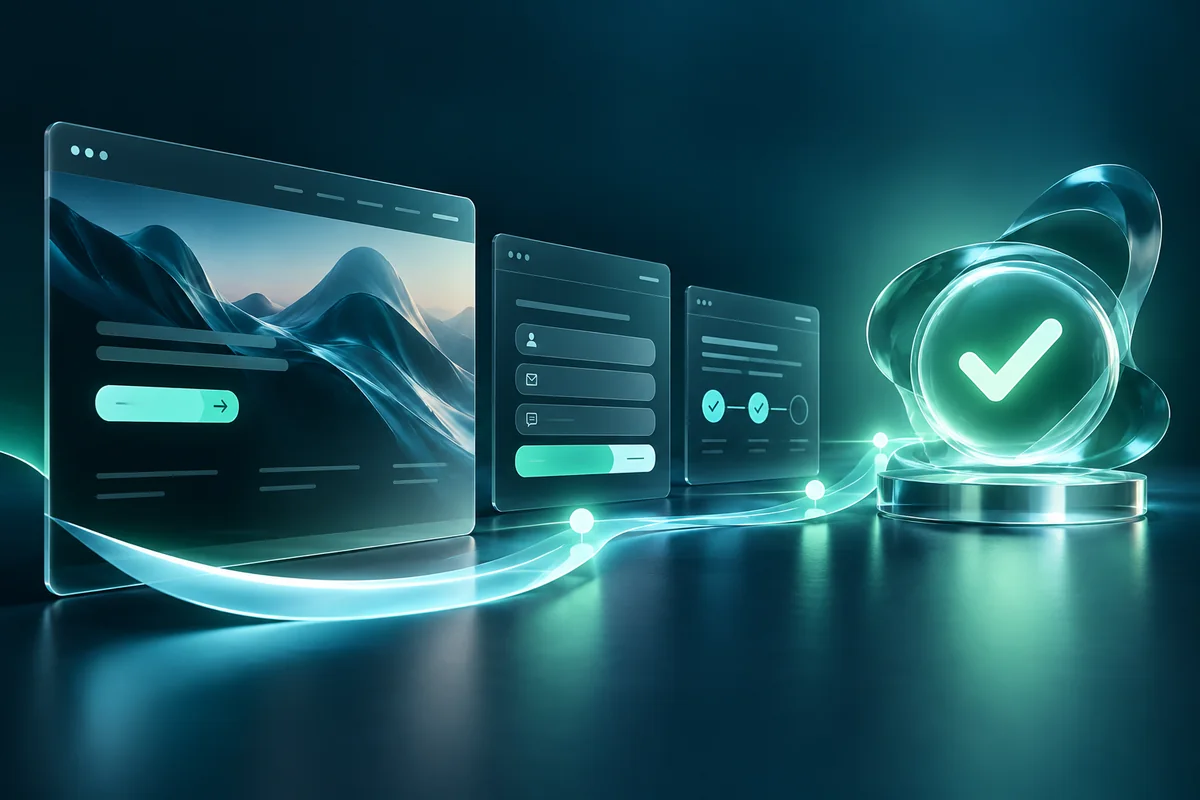
A landing page should help the right visitor make a confident decision. It needs to explain an offer, answer the questions that matter, and make the next step easy. Attractive design supports that job, but it cannot rescue an unclear offer or a broken enquiry journey.
For a service business, more submissions are not always the right outcome. A page that attracts unsuitable enquiries can increase administration without improving sales. The useful objective is a clear route from relevant interest to a qualified conversation.
This guide explains how to plan a lead-generation landing page, choose evidence, improve its form, and evaluate results without relying on generic conversion promises.
Begin with one audience and one decision
Identify who the page is for and what they are trying to decide. A visitor considering a website redesign has different questions from someone who needs urgent support for a failing contact form.
Write the primary decision in one sentence: “This page helps a service-business owner decide whether to request a redesign consultation.” Use that sentence to review every section. If a section does not help the decision, consider whether it belongs elsewhere.
Define the next step just as clearly. It might be a project enquiry, a booked discovery call, or a request for an assessment. Multiple actions can coexist, but the page should make the main route obvious rather than giving every link equal visual weight.
Match the page to the source of the visit. Google Ads' landing-page guidance emphasises relevance between the advertisement, keywords, and destination. The same practical principle helps with email and social campaigns: fulfil the expectation that brought the visitor there.
Explain the offer before describing the company
A useful opening identifies the service, the audience, and the practical benefit. Avoid a headline so broad that it could belong to any business. “Digital solutions for the future” does little to explain what a customer can buy or why they should keep reading.
Follow the headline with a short explanation of the actual work. Describe the scope in ordinary language. A redesign might include structure, content layout, responsive implementation, and enquiry testing. If a feature is optional, say so later in the page rather than presenting every possible service as standard.
Give visitors a clear action, but do not force a decision before they have enough information. A visible link to the enquiry section can coexist with supporting content further down the page.
The hero image should support the offer. Relevant work, a thoughtful interface preview, or a useful process visual is more informative than a decorative stock photograph that says little about the service.
Answer buying questions in a sensible order
Visitors need different levels of detail, but a useful page usually answers a recognisable sequence: What is this? Is it for me? What will happen? Why should I trust the provider? What do I need to do next?
Organise sections around those questions. Explain the service outcome, relevant scope, project process, evidence, and next step. Use headings that help scanning rather than clever labels that obscure the content.
Discuss boundaries as well as benefits. If content writing or ongoing maintenance requires a separate agreement, make that clear. Setting expectations early can reduce unsuitable enquiries and prevent misunderstandings later.
A hypothetical redesign page could include a short comparison of a new build and an improvement project. That helps visitors describe their need more accurately without requiring them to know technical terminology before submitting a form.
Use evidence a visitor can evaluate
Show relevant portfolio examples and explain the work performed. A screenshot establishes appearance; a short project explanation adds context about structure, functionality, or editing requirements.
Use genuine testimonials with permission and suitable attribution. Do not invent a client quote or add an unsupported numerical result. If a project has measured outcomes, explain the measurement and relevant context rather than presenting an unexplained percentage.
Match the evidence to the offer. An ecommerce example may be useful for store development but less persuasive on a page focused on a professional service firm's enquiry workflow.
Provide a route to inspect more detail. The Ali Dev Solutions portfolio shows examples of website work, while a focused landing page can select the projects most relevant to its audience.
Design for reading and action on mobile
Review the page at the narrow widths your customers use. Headings should remain readable, content should not overflow, and actions should be easy to distinguish and tap.
Keep the first screen purposeful. A huge decorative section can delay the explanation of the offer. Equally, compressing everything into a crowded screen can make the page difficult to understand. Aim for a clear hierarchy rather than a particular screen count.
Images should show the meaningful parts of the subject. A portfolio preview that crops the key interface or a portrait that cuts off the face can undermine an otherwise polished layout.
Test form labels, validation messages, and the on-screen keyboard. A page can look good in a static mobile screenshot while being frustrating during actual input. Review the complete submission journey, not just the empty form.
Ask for the information needed to respond well
Every field should have a purpose. A project enquiry may need a name, contact email, and description of the need. A current website URL can be optional when some customers are starting from scratch.
Use budget, timing, or service-choice fields only when they genuinely help the business route enquiries. Explain unfamiliar choices and provide a sensible option for visitors who are unsure.
Do not make sensitive information a casual requirement. A first enquiry rarely needs account passwords or private customer data. Collect detailed access information later through an appropriate project process.
Make labels visible and errors specific. If an email address is invalid, point to that field and preserve the visitor's other entries. A generic failure message should not erase the work they have already done.
Make success mean the message was accepted
The confirmation should reflect the server's actual result. A button click is not a submitted enquiry. A page that displays success before the request completes can mislead visitors and inflate reporting.
Prevent accidental repeated submissions while a request is pending, and provide a useful error state if it fails. Where practical, store the accepted enquiry so the business is not dependent on a single notification email.
Explain what happens next without promising a response time the team cannot maintain. If visitors can use another contact method, make that route easy to find.
The GA4 lead-tracking guide explains how to measure confirmed success rather than counting clicks as leads. Reliable measurement begins with a reliable submission flow.
Measure lead quality alongside volume
Choose a small set of useful measures before launching the page:
| Measure | Why it helps |
|---|---|
| Relevant visits | Shows whether the campaign reaches the intended audience |
| Accepted enquiries | Measures completed submissions rather than attempted clicks |
| Qualified conversations | Connects the page with the sales process |
| Common objections | Identifies information the page may be missing |
| Submission failures | Exposes functional friction that design changes will not fix |
Record how the business defines a qualified enquiry. Otherwise different team members may classify the same message differently, making comparisons unreliable.
Review a sample of enquiries with the person responding to them. If customers misunderstand the service, revise the offer explanation. If suitable visitors hesitate, examine missing evidence, unclear process, or an unnecessarily demanding form.
Improve one hypothesis at a time
Create a change log with the problem, proposed change, expected effect, and review date. For example: “Visitors ask whether the service includes content migration; add a scope explanation near the process section.”
Avoid changing the headline, offer, price, images, form, and campaign targeting together if you want to learn which change mattered. A focused revision is easier to evaluate.
Where traffic is low, formal split testing may not produce a useful answer quickly. Use usability feedback, enquiry quality, and careful observation alongside analytics. Do not announce a winner based on a handful of conversions.
Keep functionality checks in the routine. A promising design experiment is irrelevant if the form stopped delivering messages after an unrelated update.
Questions about service landing pages
Should I remove all navigation?
It depends on the journey. A focused campaign may benefit from fewer competing destinations, while visitors evaluating a high-consideration service may need access to work and company information. Test the decision against the audience's needs.
How long should the page be?
Long enough to answer important buying questions without repetition. A complex service often needs more explanation than a simple offer. Length alone is not a conversion strategy.
Can a landing page guarantee more sales?
No. Results depend on the offer, audience, traffic quality, pricing, sales follow-up, and implementation. A useful page makes the decision clearer and provides measurable evidence for improvement.
If your current page receives traffic but few suitable conversations, contact Ali Dev Solutions with the offer, traffic sources, and questions customers regularly ask. Those details provide a stronger starting point than a purely visual redesign brief.